JackElderDesign
JackElderDesign
JackElderDesign

PNC Bank
PNC Bank
PNC Bank
03
03
RESPONSIBILITES
UI
UI
ART DIRECTION
ART DIRECTION
DELIVERABLES
Responsive website
{ SCROLL }
→
INTRO
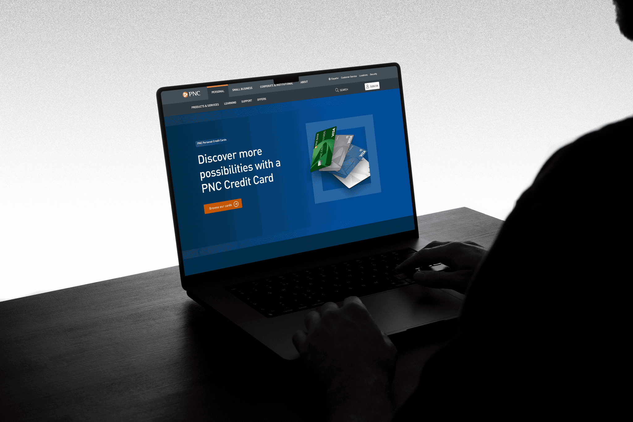
The BIO Toronto office were in the late stages of delivering a completely revamped PNC.com experience.
With PNC updating their brand guidelines at a late stage, and with other question marks around the delivered creative - the London office was asked to revamp the look-and-feel and create a new design language in line with the new identity.


PROJECT CHALLENGES
Define a new look & feel, leveraging the new brand guidelines
Define a new look & feel, leveraging the new brand guidelines
Come up with a brand new illustration style
Come up with a brand new illustration style
Push the overall aesthetic into a more modern space, without alienating the core demographics
Push the overall aesthetic into a more modern space, without alienating the core demographics
Create design style that can used across PNC digital experiences
Create design style that can used across PNC digital experiences
Responsive, build ready design output
Responsive, build ready design output


To inform all our design decisions, rigorous and targeted research was undertaken. Immersing ourselves into the banking world and understanding where the PNC brand should fit was our goal.
To inform all our design decisions, rigorous and targeted research was undertaken. Immersing ourselves into the banking world and understanding where the PNC brand should fit was our goal.
RESEARCH
Competitor Review
Competitor Review
Best-in-class research
Best-in-class research
Analysis of PNC brand and positioning
Analysis of PNC brand and positioning
LOUD QUIET LOUD
Placing the new PNC creative in a modern space, and at the same time not alienating the existing customer base was essential.
We looked at how challenger banks, as well as the more established banks showcase themselves online. There’s two key approaches to learn from - traditional banks are great at humanising digital with photography while newer challenger banks tend to be more vibrant and playful with digital assets.


All-in-all a very enjoyable, fast-paced project. The client was very happy with the new look & feel, and I am looking forward to how it performs once live.
All-in-all a very enjoyable, fast-paced project. The client was very happy with the new look & feel, and I am looking forward to how it performs once live.
