JackElderDesign
JackElderDesign
JackElderDesign
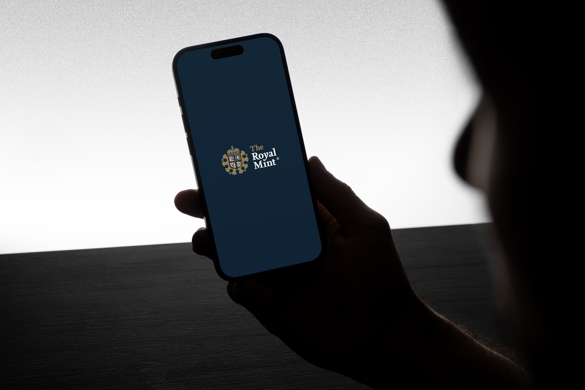
TRM Bullion App
TRM Bullion App
TRM Bullion App
03
03
RESPONSIBILITES
UI DESIGN
UI DESIGN
DELIVERABLES
Mobile App
{ SCROLL }
→
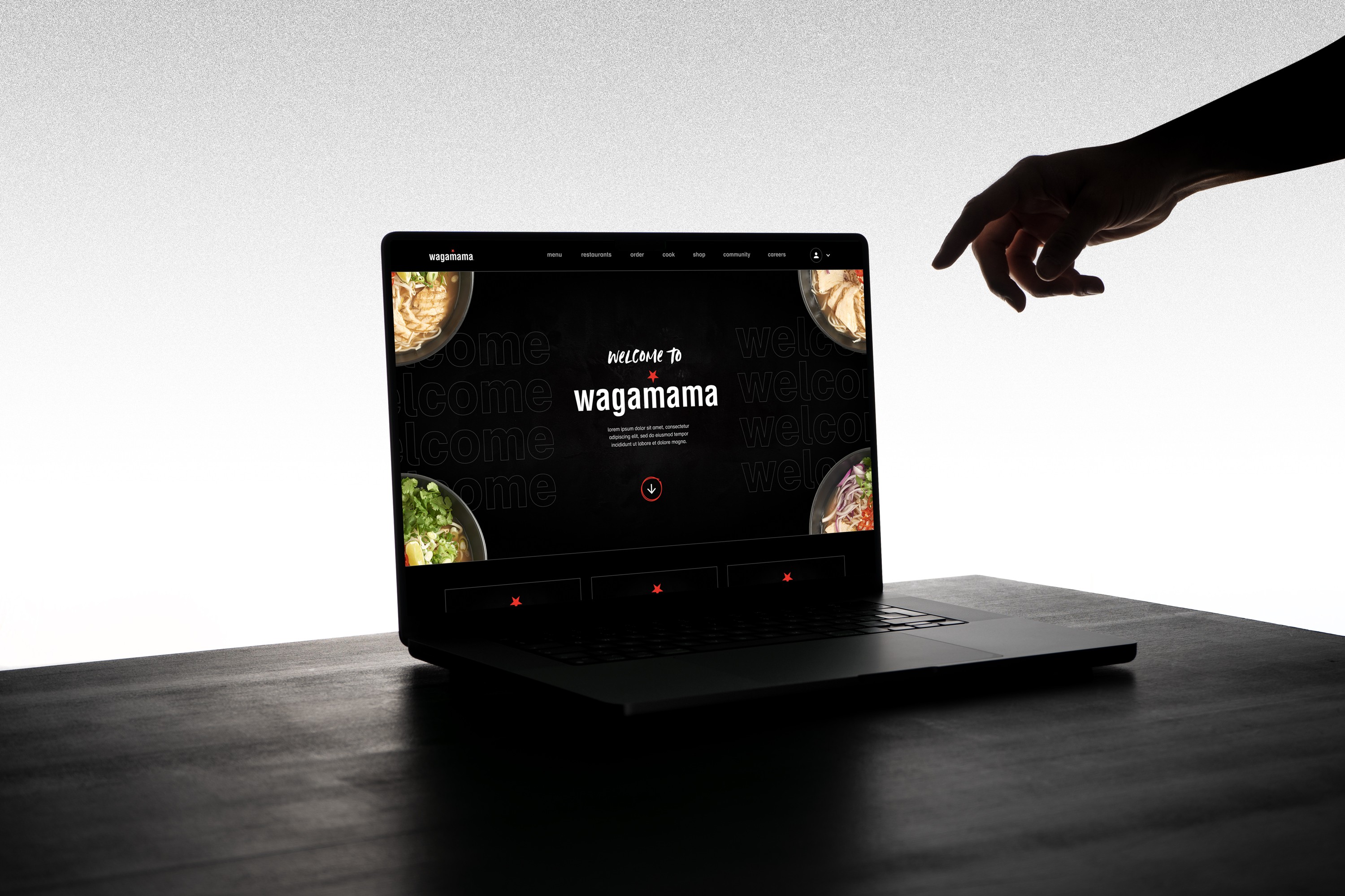
INTRO
The Bullion app is the world’s first precious metal trading & e-commence app, produced for The Royal Mint. Our aim was to give customers easy access to precious metal trading wherever and whenever.
The Bullion app is the world’s first precious metal trading & e-commence app, produced for The Royal Mint. Our aim was to give customers easy access to precious metal trading wherever and whenever.

The apps architecture has three main pillars of information. A simple and efficient on-boarding process and help tool, convenient ways to sort and trade bullion and a news portal for up to the minute articles from within the industry.
The apps architecture has three main pillars of information. A simple and efficient on-boarding process and help tool, convenient ways to sort and trade bullion and a news portal for up to the minute articles from within the industry.

With very data driven content on show it was paramount that the aesthetic and UI was efficient and easy to understand. The most important information was related to live product prices - uncluttered layouts, along with clear colour coding as well distinct text styles helped lend to a more digestible experience.
With very data driven content on show it was paramount that the aesthetic and UI was efficient and easy to understand. The most important information was related to live product prices - uncluttered layouts, along with clear colour coding as well distinct text styles helped lend to a more digestible experience.

Bringing such a prestigious brand into the digital sphere it was not only important to have a fluid and effortless user experience, but also an intuitive interface which also reflects the brands premium positioning.
Bringing such a prestigious brand into the digital sphere it was not only important to have a fluid and effortless user experience, but also an intuitive interface which also reflects the brands premium positioning.

We employed parallax movement when scrolling, as well as a slight glimmer of our gold CTA buttons. These subtle moments added to the experience and mirrored the brands premium qualities.
We employed parallax movement when scrolling, as well as a slight glimmer of our gold CTA buttons. These subtle moments added to the experience and mirrored the brands premium qualities.